For decades, the experience of eating a Chupa Chups lollipop began with a universal ritual: the wrestle. Consumers across the globe have used teeth, fingernails, and sheer willpower to get through that notoriously tight plastic seal. In 2026, Chupa Chups has finally declared the “match” over.
To launch their new easy-to-open packaging, the brand teamed up with BBH London for a visually stunning OOH (Out-of-Home) campaign titled “No More Wrestling.” Instead of a dry, corporate announcement about “improved ergonomics,” they leaned into the vibrant, high-octane world of Mexican Lucha Libre.
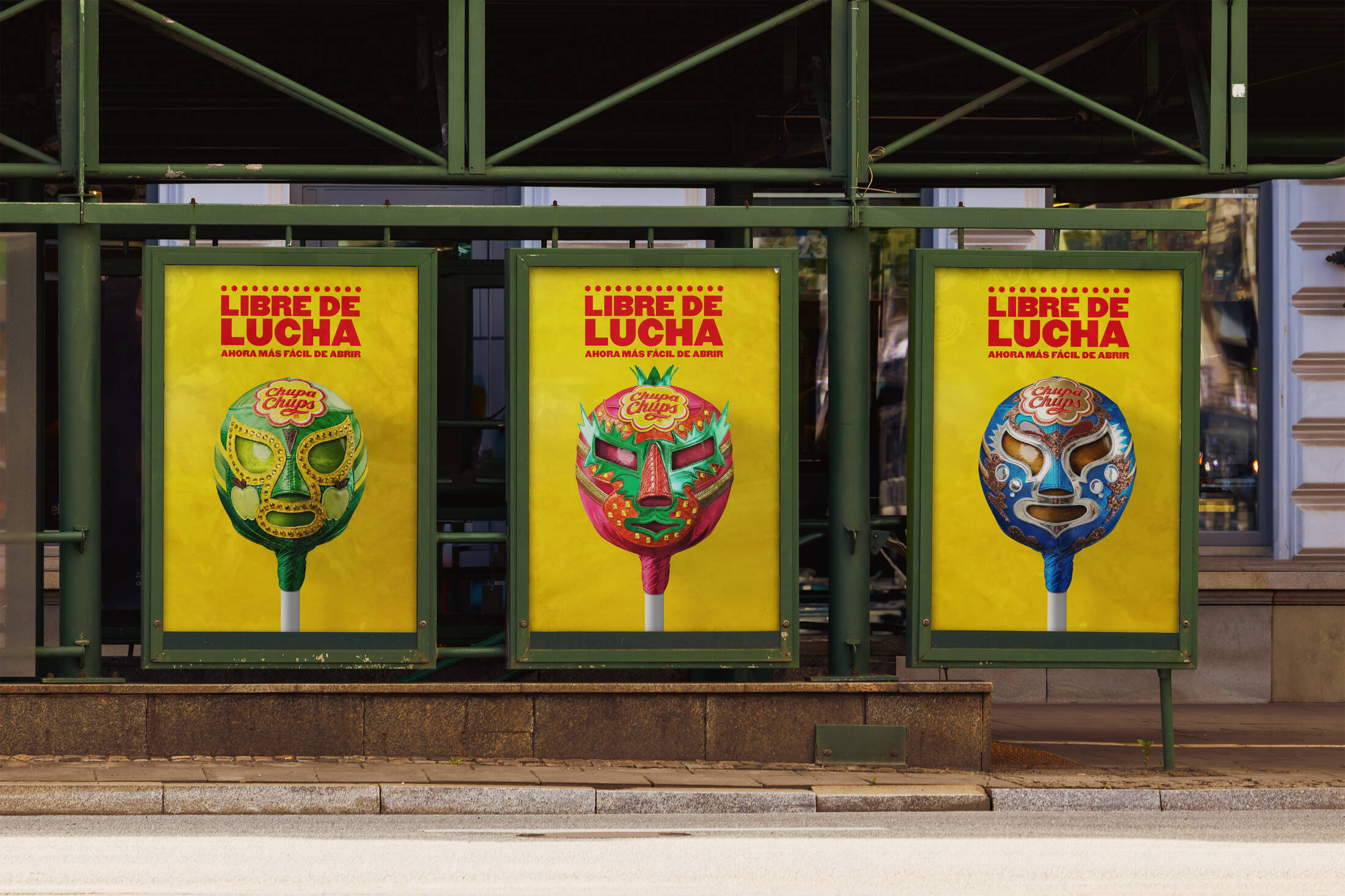
The Art of the Mask: A Cultural Deep Dive
The soul of this campaign lies in its craftsmanship. Chupa Chups didn’t just use stock imagery; they collaborated with legendary Mexican mask maker Arturo Bucio. Together, they created physical, custom-designed wrestling masks that serve as a direct mirror to the brand’s iconic flavors.
-
The Strawberry Mask: Swirls of red and cream that mimic the classic lollipop pattern.
-
The Cola and Apple Masks: Using the specific typography and color palettes that have made Chupa Chups a staple of the candy aisle for over 60 years.
By turning the “wrapper” into a “wrestler’s mask,” the brand honors the struggle consumers once had, while celebrating the new, effortless experience. It is a rare example of a brand acknowledging a product flaw so creatively that it actually strengthens brand love.
Street-Style Aesthetic and Large-Format Impact
The rollout, supported by Wavemaker, focuses heavily on the UK and Spain, utilizing outdoor placements that match the grit and energy of the creative.
-
Flyposting Sites: By placing these “wrestling posters” on street-level flyposting sites, the campaign feels less like a corporate ad and more like a grassroots event announcement.
-
Bold Typography: Borrowing from traditional Mexican wrestling posters, the high-contrast layouts and loud fonts ensure that the “No More Wrestling” message is legible even from a distance or through the window of a moving bus.
Why It Works: Empathy Through Humor
Most brands are afraid to mention that their product was ever “difficult” to use. Chupa Chups took the opposite route. By using the Lucha Libre metaphor, they showed consumer empathy. They admitted, “We know opening these was a battle,” and then provided the solution.
This campaign is a masterclass in Unified Visual Systems. It connects the physical packaging (the flavor designs) to a cultural icon (the Lucha mask) and places it in a physical environment (the street) where the “street-style” aesthetic makes it instantly shareable on social media.
Conclusion
With the “No More Wrestling” campaign, Chupa Chups has achieved something difficult in modern advertising: they’ve made a functional packaging update feel like a cultural moment. By retiring the “wrestle,” they’ve ensured that the only thing consumers will remember about the old wrapper is how much fun the brand had replacing it.