Every successful brand has one thing in common — a distinct visual identity that stays etched in the consumer’s mind. Whether it’s Coca-Cola’s vibrant red, Starbucks’ soothing green, or Facebook’s iconic blue, color plays a vital role in shaping how people perceive, remember, and emotionally connect with brands.
In 2025, as digital competition intensifies and consumer attention spans shrink, understanding the psychology of colors in branding and consumer decision-making has become more important than ever. The right color isn’t just a design choice; it’s a strategic decision that influences trust, emotions, and buying behavior.
Why Color Psychology Matters in Branding
Color is one of the first elements people notice about a brand. Research shows that up to 90% of snap judgments made about products can be based on color alone.
Colors are powerful because they communicate emotion faster than words. They can trigger memories, evoke feelings, and set expectations — often subconsciously.
For marketers and designers, understanding color psychology means using visual cues to guide consumer perception, enhance recognition, and influence action.
How Colors Influence Consumer Emotions
Each color carries a psychological association rooted in human experience and cultural context. While interpretations may vary by region or gender, certain emotional responses to color remain consistent across audiences.
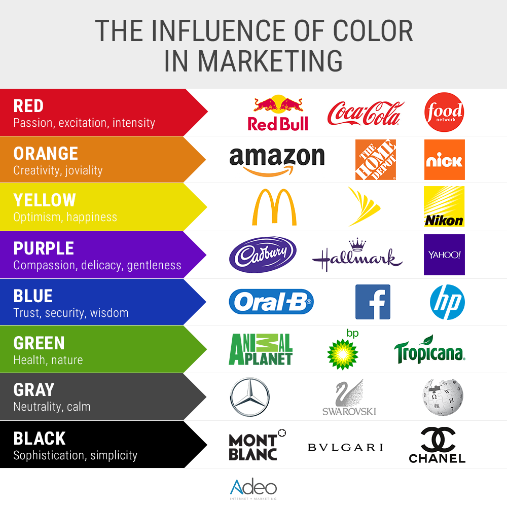
Let’s break down the emotional language of color and its role in branding:
1. Red – Passion, Energy, and Urgency
Red is bold, emotional, and stimulating. It evokes excitement, passion, and even hunger — which is why food and beverage brands like Coca-Cola, KFC, and Zomato use it extensively.
It grabs attention instantly, making it perfect for call-to-action buttons, sale banners, and entertainment brands.
However, too much red can also signal aggression or danger, so it works best when balanced with neutral tones.
2. Blue – Trust, Calm, and Reliability
Blue is associated with stability, trust, and intelligence. It’s the color of the sky and sea — elements that feel dependable and infinite.
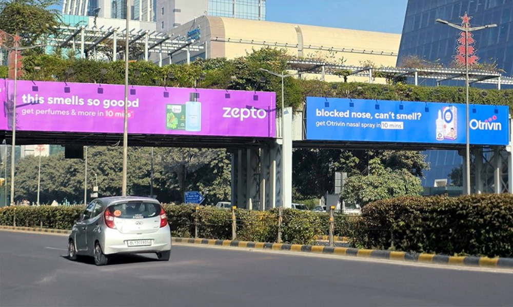
Brands like Facebook, HDFC Bank, IBM, and LinkedIn use blue to communicate reliability, professionalism, and calm authority.
It’s particularly effective in finance, healthcare, and technology, where trust is paramount.
Lighter shades evoke peace and clarity, while darker blues reflect strength and confidence.
3. Yellow – Optimism and Attention
Yellow is bright, cheerful, and attention-grabbing. It represents happiness, optimism, and energy.
Brands like McDonald’s, Snapchat, and IKEA use yellow to create feelings of warmth and friendliness.
In marketing, yellow is used to highlight deals or create urgency but must be used wisely — too much can cause visual fatigue.
4. Green – Growth, Balance, and Sustainability
Green symbolizes nature, health, and prosperity. It’s a calming color that conveys freshness and renewal.
It’s no surprise that brands in healthcare, agriculture, and eco-friendly products often choose green.
Companies like Starbucks, Whole Foods, and Tropicana use it to represent well-being and environmental consciousness.
In India, green also has cultural significance, symbolizing growth and harmony.
5. Orange – Creativity and Enthusiasm
Orange combines the energy of red and the cheerfulness of yellow. It signals adventure, creativity, and confidence.
Brands like Fanta, Nickelodeon, and Amazon use orange to appear fun, energetic, and approachable.
For startups and D2C brands, orange creates a youthful, upbeat vibe that encourages exploration.
6. Purple – Luxury, Imagination, and Wisdom
Purple has long been associated with royalty, luxury, and spirituality. It also suggests creativity and depth.
Brands like Cadbury, Hallmark, and FedEx use purple to create a sense of exclusivity and sophistication.
In modern branding, it’s often used for premium products, beauty brands, and technology firms that want to stand out as elegant and innovative.
7. Black and White – Minimalism and Power
Black denotes elegance, control, and sophistication, while white represents purity and simplicity.
Used together, they create timeless, high-contrast identities. Brands like Apple, Chanel, and Nike use monochrome palettes to reinforce modernity and class.
Black commands authority, while white provides clarity — together, they build strong visual impact.
8. Pink – Femininity, Playfulness, and Positivity
Pink is associated with compassion, love, and youthfulness.
While traditionally linked to femininity, brands today use varied shades of pink to express positivity and individuality.
Companies like Barbie, T-Mobile, and Airbnb have used pink tones to modernize their identity and appeal to emotion-driven audiences.
9. Brown – Reliability and Earthiness
Brown communicates stability, warmth, and simplicity. It’s common in organic, food, and home brands that want to appear grounded and trustworthy.
Brands like Nestlé and Hershey’s use brown to reflect wholesomeness and comfort — perfect for audiences seeking authenticity.
Color Psychology in Consumer Decision-Making
Color doesn’t just define brand aesthetics — it influences purchasing decisions at every stage of the consumer journey.
Let’s see how:
1. Attracting Attention
In a crowded marketplace, color is often what makes a brand stand out. Vibrant hues catch the eye faster than text or imagery.
A shopper scanning supermarket shelves or a user scrolling through an app will pause where color contrast and brightness draw them in.
Brands use this instinctive reaction to capture attention instantly and invite deeper engagement.
2. Building Brand Recognition
Color consistency improves brand recall. Studies show that using a signature color can increase brand recognition by up to 80%.
Think of Coca-Cola’s red or Tiffany’s blue — one glance, and you know the brand.
Consistency across packaging, ads, and online channels reinforces memory and trust.
3. Influencing Perceived Value
Color can also affect how premium a product feels.
For example, metallics like gold and silver suggest luxury, while pastels imply affordability and friendliness.
A perfume in a black matte box feels high-end, while the same scent in a light pink package feels casual and playful.
This shows how color subconsciously affects price perception and desirability.
4. Guiding Behavior and Emotion
Marketers use color strategically to direct behavior — from red “Buy Now” buttons that spark urgency to green “Proceed” signs that encourage action.
Color also shapes mood: blue calms users during financial transactions, while red energizes them during flash sales.
In other words, the color experience influences both emotion and conversion.
Cultural Sensitivity in Color Usage
Color meanings vary widely across cultures, and brands expanding across regions must adapt accordingly.
For instance:
-
In Western cultures, white symbolizes purity, while in parts of India, it signifies mourning.
-
Red represents luck in China but danger in some Western contexts.
-
Yellow is sacred in Hindu traditions yet cautionary in Western traffic signals.
Brands like Pepsi, Dove, and Samsung localize color palettes to align with regional sensibilities — a crucial step for effective global and regional marketing.
The Role of Technology and AI in Color Strategy
In 2025, AI and machine learning tools help marketers analyze which color combinations drive engagement and conversions.
Platforms like Adobe Color and Google Vision AI track how audiences respond to colors in different demographics and adjust campaigns in real time.
Brands also use A/B testing to find the most effective button colors, banner shades, and ad backgrounds — optimizing emotional triggers for every audience segment.
Choosing the Right Color Strategy for Your Brand
To use color effectively in branding, marketers should focus on three key principles:
-
Know Your Audience: Research cultural, gender, and emotional preferences before finalizing a color scheme.
-
Stay Consistent: Use a signature palette across all touchpoints — from website to packaging — to strengthen recall.
-
Test and Adapt: Monitor color performance across platforms and optimize based on audience feedback and analytics.
A well-defined color palette doesn’t just decorate a brand — it defines its voice, trust, and value perception.
Conclusion
In the age of visual overload, color is the language that speaks before words do.
Understanding the psychology of colors in branding and consumer decision-making helps marketers move beyond aesthetics to strategy — using color to evoke emotion, signal intent, and inspire loyalty.
Whether you’re building a startup or managing a legacy brand, choosing the right colors is more than design — it’s a psychological advantage.
In 2025 and beyond, successful brands will not only look good but feel right — because their colors will speak directly to the consumer’s heart and mind.


